Wednesday, April 27, 2016

Tulle flowers


These are a few tulle flowers I made last night after watching many YouTube videos.  Have I mentioned how addicted I am to YouTube?  Well I am!

Anyway, these are the easiest things to make and I love them.  I want to get some sheer material and try to make some with sheer material and tulle together.  Not sure how that will work but I'm gonna give it a try.

Thanks for checking out my flowers.  Would love to know what you think and if you have ever made these before.

Friday, April 22, 2016

Basic Training layout

Layout of my daughter's boyfriend who just graduated from basic training in the Army.  I used a kit from Simple Stories called HERO.  Everything is from the kit.  I have not done the journalling because I want to have Hunter do it when he gets home or have my daughter do it from her perspective.  Or I may just do basic documentation of when he enlisted, when she entered basic and when he graduated and what is next phase will be.  Not sure of the journalling yet.  I love this kit but it seems to be a bit Air Force heavy and since he is Army it was a bit of a struggle.  I want to do a companion page of my daughter and him at family day and graduation.  This layout was also a part of the MercyTiara's 27 Day Challenge on Facebook to do a masculine layout.

Wednesday, April 13, 2016

Cooking Class layout


Layout of my daughter and her 2 friends taking a 4-H Cooking Class. 
I used items from Yahoo Group Scrap-a-holic anonymous group January 2012 In the Kitchen swap. 


I inked the edges of everything with Old Road chalk ink that I got in a scraptastic club kit (no idea the brand.  The print is too small).  I added a few stickers and the title.  I need to write the journalling in the file folder and look up the date of the class and add a date stamp.

Sunday, April 10, 2016

Hallie's First Easter


I created this layout of my granddaughter's first Easter using a sketch from Lisa Echerd's 2015 sketch book.  I love her sketch books because she gives photo and paper sizes and swaps and suggestions to alter the sketch.  She also includes a video link (if there is one for the sketch) to a video where she herself used the sketch.  I changed it up a bit and instead of hanging tags I added the adorable crocheted doilies I got from Ebay and I added the journalling on a tag at the bottom.  I added sequins because the jar of pastel sequins was on my table and I thought "why not".  The layered border strip at the top was in my stash for YEARS and I have no idea where it came from.  There were three on a strip and this one actually said happy spring and there was another that said happy Easter so I did a bit of surgery and swapped out the titles.  The pink card stock and the Easter papers have also been in my stash for a million years and I have no idea where they came from.  The yellow thickers are from The Paper Studio MozzaRella font.  The pink tile letters are October Afternoon Mini Market in Peppermint.

My little granddaughter smiles like this all the time.  She is such a happy baby.  I don't get to see her often since I live in Arkansas and she lives in Wisconsin but we skype so she doesn't forger me.  :)

Wednesday, April 6, 2016

Boys and their toys

Sketch
Silhouette Studio initial design
Final layout
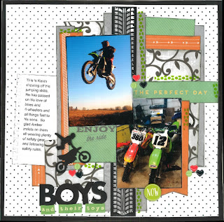
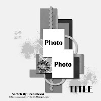
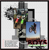
I used a sketch from Let's Get Sketchy to create this layout for the MercyTiara's 27 Day Scrappy Challenge on Facebook.  The challenge this month is to do a masculine or boy themed layout.  So, I picked these photos from my son-in-law's Facebook page of him jumping his bike and one of his bikes.  I cut the tire track, bike with rider and the "BOYS" part of the title with my Silhouette Cameo.  I had designed a layout in my Silhouette Studio software as I usually do when working with a sketch.  The layout looked incredible (I still kinda like it bettter).  Anyway, I pulled up the SS design, found some gray and black paper and cut out the elements and layering papers.  Then I sat down at my work area and found a paper pad of cut aparts that I got from Walmart awhile ago.  I noticed that there were orange and green elements that matched (or closely matched) the reddish orange and green in the bikes.  So, I started cutting them out and inking the edges in gray ink and just started playing.  Then I added green enamel dots and orange & black enamel hearts to three areas and added my journalling on a piece of card stock that I cut into a notebook paper piece (I still need to glue it i place.  I had to print it at work and forgot to bring a tape runner with me so the journalling is askew in the photo).  My original design had ink splatters (to mock mud because the boys are usually covered in mud after riding) but I was afraid to mess it up because I don't do splattering very often and was unsure of myself.  What I was originally planning was to print the splatters onto non printable acetate and then rub it on the background.  However, I was out of black ink and wanted to get this layout done.  I do plan on trying that technique sometime when I get more black ink but for now, I'm calling this one done.

Sunday, April 3, 2016

Trophies layout


This is a layout I created for the MercyTiara's 27 Day Challenge group on Facebook.  The challenge was to do a boy or masculine layout.  I don't do a lot of boy layouts (I should because I have 4 grandson's).  My grandson's live in Wisconsin and I live in Arkansas.  So, I am not with them on a day to day basis.  This was from a trip we took to Wisconsin in July, 2014.  I have had the picture sitting here waiting to be scrapped and this challenge gave me the push I needed.  I used a sketch from Lisa Echerd's 2015 Sketch Book page 19.  It helped with my scrappers block.  The entire layout is a bit wonky but one thing went on crooked so I purposely put things on wonky.  I do like how it turned out.  I think it is missing something.  I may revisit it later and figure it out and add whatever I figure out it is missing.  Suggestions would be GREAT.  :)   Thanks.