I wanted to capture my daughter's (and most of the population of the world's) obsession with selfies. So, I got on all of her social media sites and pulled off a ton of selfies she has taken of just herself and her with her friends. There are 29 on this layout and I think they are all from a span of 3 months.
I also wanted to capture the hashtag (#) popularity hence the title #SELFIE. I had a flare that said "But first, Let me take a selfie" and then one that says "Oh snap" and a flare with a camera and the word "click" in the lens. Those all went very well with the theme. I used a camera motif background & put all the photos in film strips that I cut with my Silhouette Cameo. I also used the Silhouette software to size my photos to fit the holes in the film strips, added my title in black foam letters, typed journalling and a few homemade enamel dots. Finally, I added a cartoon image of older ladies taking a selfie and told my daughter that was her and her friends years from now.
Wednesday, October 29, 2014
Sunday, October 5, 2014
Recipe organizer box with file from Kathy Orta

This is my recipe organizer box I made with a file from Kathy Orta at paper phenomenon.
File box from Kathy Orta at paper phenomenon
This shows the drawer that houses the shopping list/coupon organizer and a pencil and whatever else you need.
Here is the shopping list/coupon organizer from the Silhouette online store. silhouette online store
The file has a ton of score lines. I personally prefer to manually score my fold lines so I don't have those little cut lines. So, I used a pencil in my pen holder and drew the score lines on and then used my score board and scoring tool to score the lines. Then I erased the pencil lines and love how that technique worked. I plan on using that technique whenever I have a file that has fold lines (score lines)
Design ID #64294
8/05/2014
8/05/2014
Here is my version. I Googled shopping list and found the list. I love the way Shopping & List are overlapped. I just had to re-size it a bit to fit my organizer. Have to say I am not a belly band fan so I may change that to a strap with a Velcro or tie or snap or something.
This is the inside of the box showing where the recipes will go on the right and the binder and take out folder on the left. I have yet to line the box but will get to it soon.
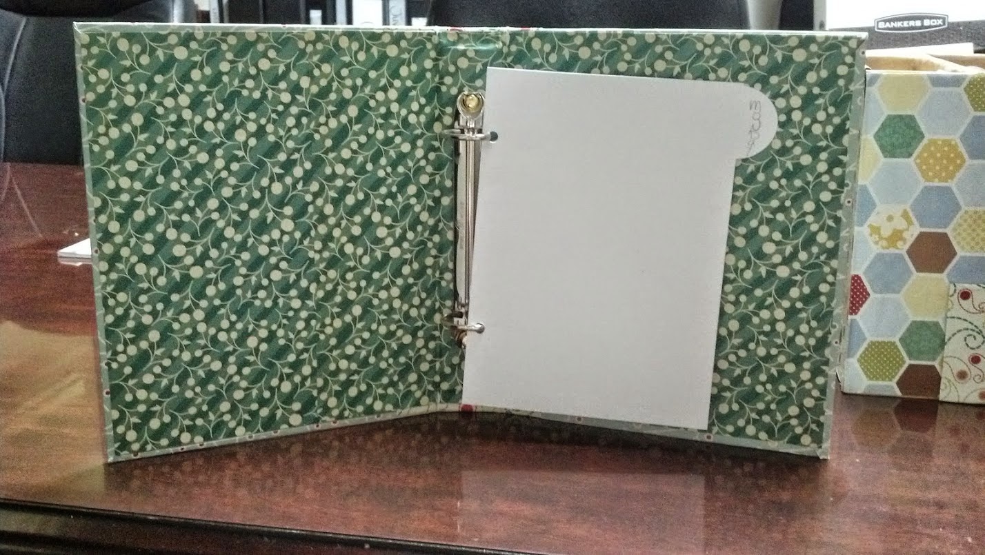
This is the binder that houses the days of the week divider tabs (which I have not finished). I will also put Planner or Weekly Meals or something on the binder edge and maybe something decorative on the front. Maybe a metal label frame with a title inside of it.
This is the take out menu folder. I am going to add Take Out Menus to the tab.
Subscribe to:
Comments (Atom)


