http://scrapping4funchallenges.blogspot.com/


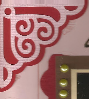
 This is a layout I did for my first S.H.O.P (stash horded on pages). I wanted to start using those things in my stash of scrapbooking supplies that I have been hording. I have a bad habit of thinking, "If I use this here, I won't have it for later." How silly is that? So I am on a mission to use up my stash and especially those horded items before allowing myself to buy more. To that end, I used the Creative Imaginations Awkward Family Photos paper and a couple of the stickers, some yellow enamel dots, alpha stickers that I have had so long I have no idea what company they were from, and three wooden precious moments type buttons (the poem called for four young ladies standing in a row so I made a 4th from my Silhouette Cameo. I cut the image 8 times and glued them all on top of each other to give the same thickness as the buttons.)